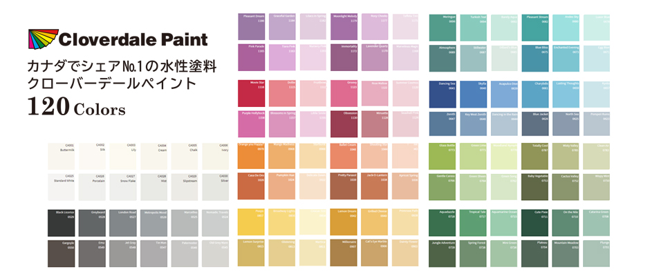
ショッピングサイトでご購入できるカラーバリエーション
カラリストが単色でも、コーディネートしても使いやすい120色を厳選しました。
*モニタ画面により実際のペイントと違って見えることがございます。ご了承くださいませ。有償にて色見本の貸し出しも行っています。お問い合わせください。
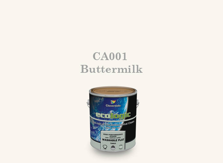
オフホワイト&ニュアンスグレー
オフホワイトから明るいニュアンスグレー、天井やアクセント以外の壁、家具など幅広く組み合わせて使えるカラーコレクションです。微妙な色合いが全体の雰囲気を左右する大切な色味です。白が揃っていると上質なインテリアになります。
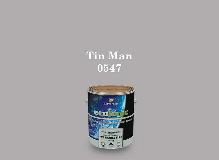
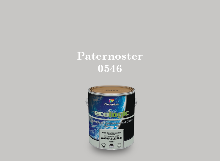
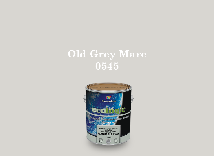
![](https://improve.ne.jp/wp-content/uploads/2023/07/white01-01.png)
![](https://improve.ne.jp/wp-content/uploads/2023/07/white02-01.png)
![](https://improve.ne.jp/wp-content/uploads/2023/07/white03-01.png)
![](https://improve.ne.jp/wp-content/uploads/2023/07/white04-01.png)
![](https://improve.ne.jp/wp-content/uploads/2023/07/white05-01.png)
![](https://improve.ne.jp/wp-content/uploads/2023/07/white06-01.png)
![](https://improve.ne.jp/wp-content/uploads/2023/07/white07-01.png)
![](https://improve.ne.jp/wp-content/uploads/2023/07/white08-01.png)
![](https://improve.ne.jp/wp-content/uploads/2023/07/white09-01.png)
![](https://improve.ne.jp/wp-content/uploads/2023/07/white10-01.png)
![](https://improve.ne.jp/wp-content/uploads/2023/07/white11-01.png)
![](https://improve.ne.jp/wp-content/uploads/2023/07/white12-01.png)
モノトーンとマットブラック
ペイントのバリエーションでは少ないモノトーンのコレクション。ナチュラルテイストよりだと抑えたブラウンがおすすめ。お好きなアクセントカラーとモノトーンの濃淡で使うと洗練されたモダンな空間に。
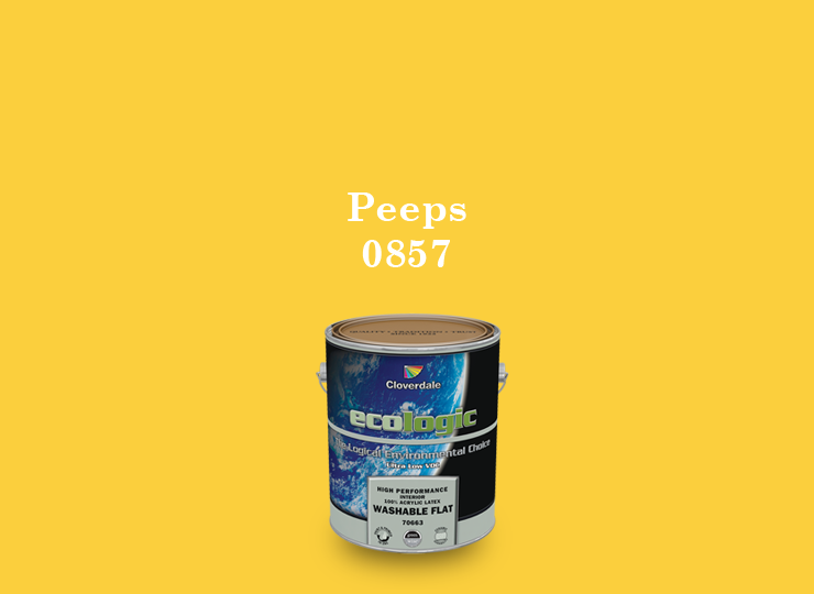
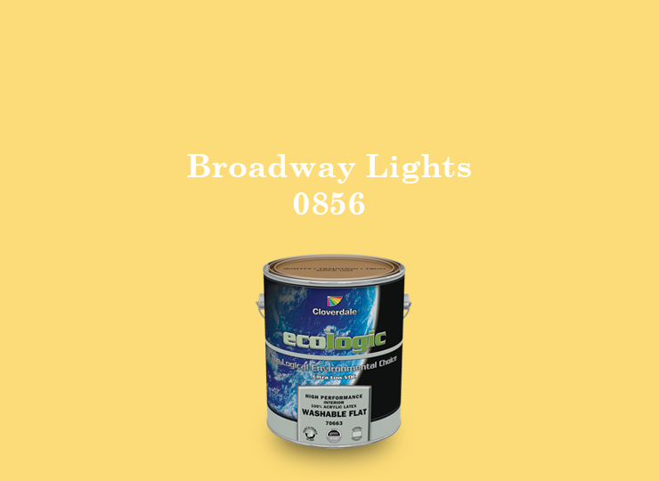
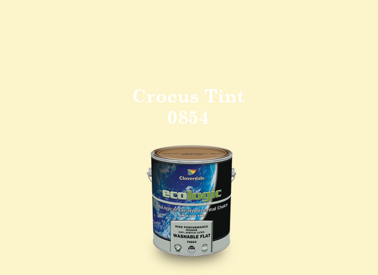
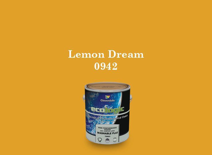
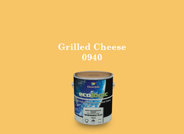
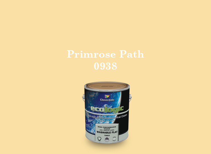
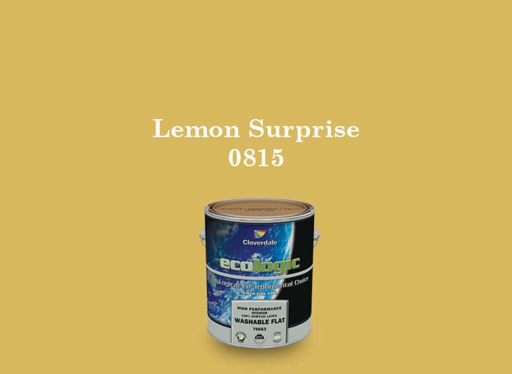
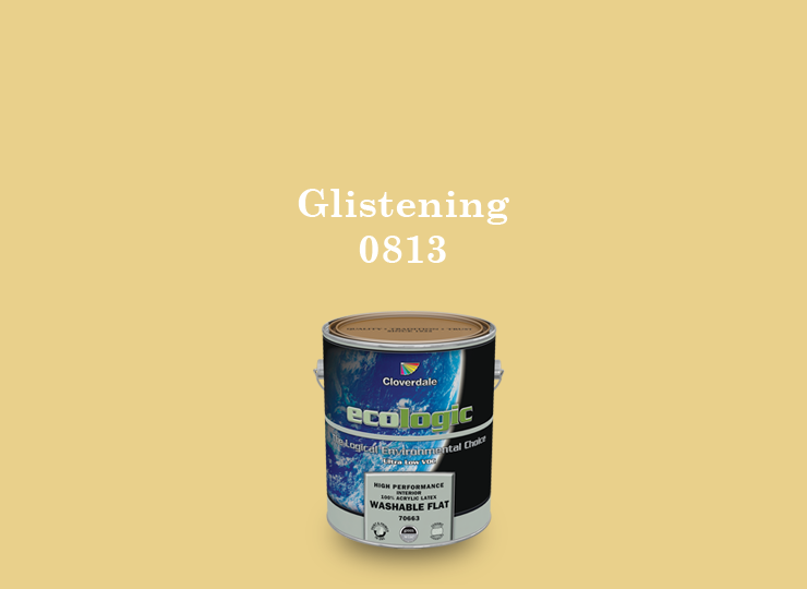
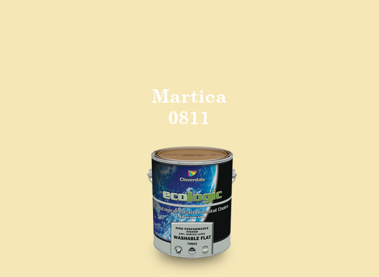
![](https://improve.ne.jp/wp-content/uploads/2023/07/black01-01.png)
![](https://improve.ne.jp/wp-content/uploads/2023/07/black02-01.png)
![](https://improve.ne.jp/wp-content/uploads/2023/07/black03-01.png)
![](https://improve.ne.jp/wp-content/uploads/2023/07/black04-01.png)
![](https://improve.ne.jp/wp-content/uploads/2023/07/black05-01.png)
![](https://improve.ne.jp/wp-content/uploads/2023/07/black06-01.png)
![](https://improve.ne.jp/wp-content/uploads/2023/07/brown01-01.png)
![](https://improve.ne.jp/wp-content/uploads/2023/07/brown02-01.png)
![](https://improve.ne.jp/wp-content/uploads/2023/07/brown03-01.png)
![](https://improve.ne.jp/wp-content/uploads/2023/07/brown04-01.png)
![](https://improve.ne.jp/wp-content/uploads/2023/07/brown05-01.png)
![](https://improve.ne.jp/wp-content/uploads/2023/07/brown06-01.png)
イエローとマスタードカラー
差し色にぴったりのイエロー。マスタードカラーだと少し大人っぽく上品な仕上がりです。温かみがある色なので、玄関やダイニングにいかが?
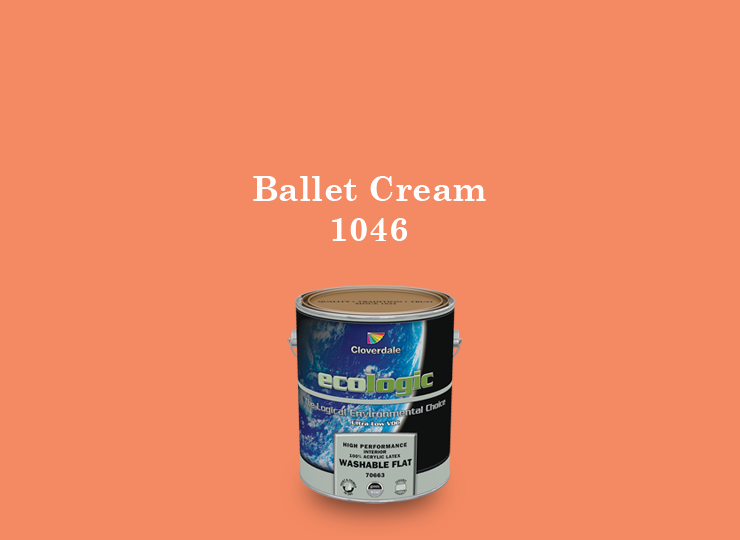
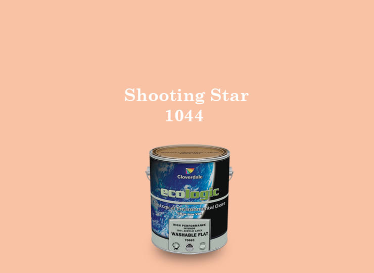
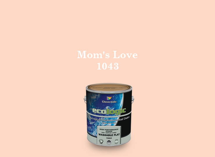
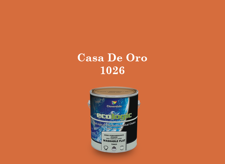
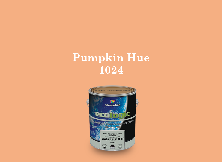
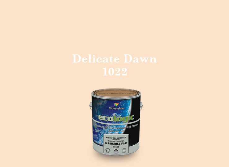
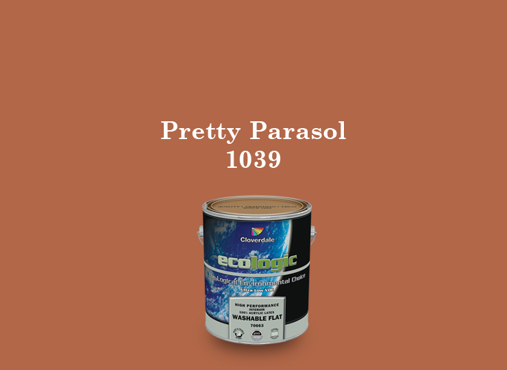
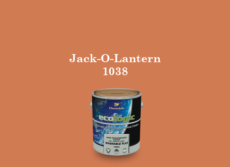
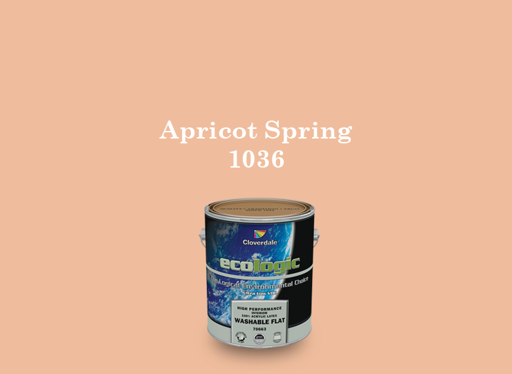
![](https://improve.ne.jp/wp-content/uploads/2023/07/yellow01-01.png)
![](https://improve.ne.jp/wp-content/uploads/2023/07/yellow02-01.png)
![](https://improve.ne.jp/wp-content/uploads/2023/07/yellow03-01.png)
![](https://improve.ne.jp/wp-content/uploads/2023/07/yellow04-01.png)
![](https://improve.ne.jp/wp-content/uploads/2023/07/yellow05-01.png)
![](https://improve.ne.jp/wp-content/uploads/2023/07/yellow06-01.png)
![](https://improve.ne.jp/wp-content/uploads/2023/07/yellow07-01.png)
![](https://improve.ne.jp/wp-content/uploads/2023/07/yellow08-01.png)
![](https://improve.ne.jp/wp-content/uploads/2023/07/yellow09-01.png)
![](https://improve.ne.jp/wp-content/uploads/2023/07/yellow10-01.png)
![](https://improve.ne.jp/wp-content/uploads/2023/07/yellow11-01.png)
![](https://improve.ne.jp/wp-content/uploads/2023/07/yellow12-01.png)
オレンジととレンガブラウン
元気いっぱいで明るいオレンジは心惹かれますね。明るい赤茶色は合わせやすく使いやすい色です。なちゅなるカラーなのでガーデニング用品にもおすすめです。
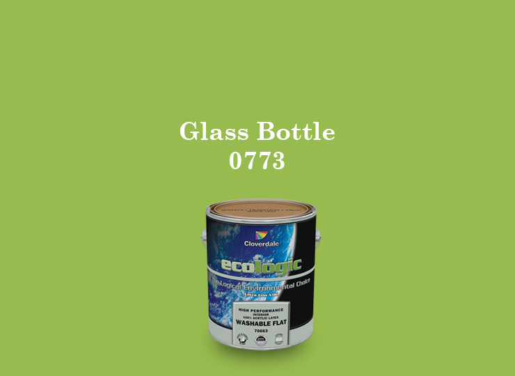
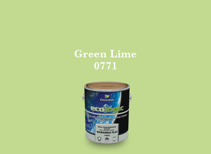
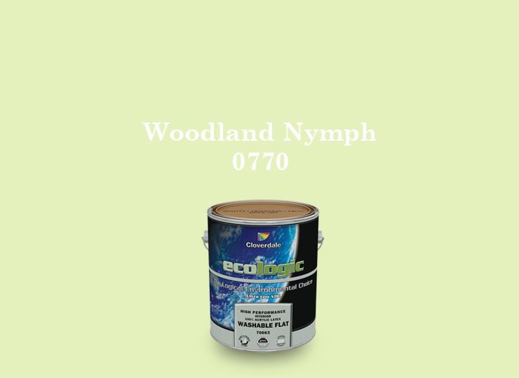
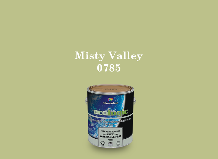
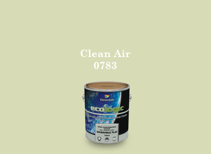
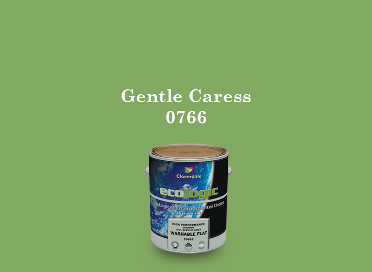
![](https://improve.ne.jp/wp-content/uploads/2023/07/orange01-01.png)
![](https://improve.ne.jp/wp-content/uploads/2023/07/orange02-01.png)
![](https://improve.ne.jp/wp-content/uploads/2023/07/orange03-01.png)
![](https://improve.ne.jp/wp-content/uploads/2023/07/orange04-01.png)
![](https://improve.ne.jp/wp-content/uploads/2023/07/orange05-01.png)
![](https://improve.ne.jp/wp-content/uploads/2023/07/orange06-01.png)
![](https://improve.ne.jp/wp-content/uploads/2023/07/orange07-01.png)
![](https://improve.ne.jp/wp-content/uploads/2023/07/orange08-01.png)
![](https://improve.ne.jp/wp-content/uploads/2023/07/orange09-01.png)
![](https://improve.ne.jp/wp-content/uploads/2023/07/orange10-01.png)
![](https://improve.ne.jp/wp-content/uploads/2023/07/orange11-01.png)
![](https://improve.ne.jp/wp-content/uploads/2023/07/orange12-01.png)
黄緑色と抹茶いろ
和を感じさせる落ち着いた抹茶色は和の空間にも使える万能カラー。明るい黄緑色のリーフグリーンは子供部屋やリビングなど明るい印象にしたいお部屋にぴったり。白のリネン系のカーテンと合わせると軽やかです。
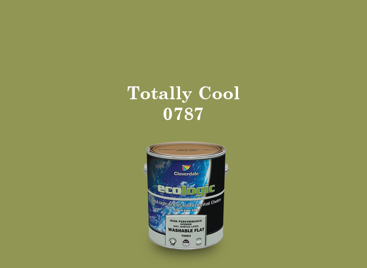
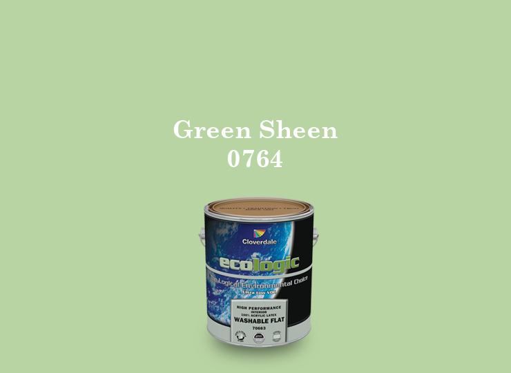
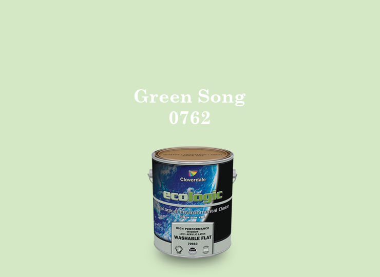
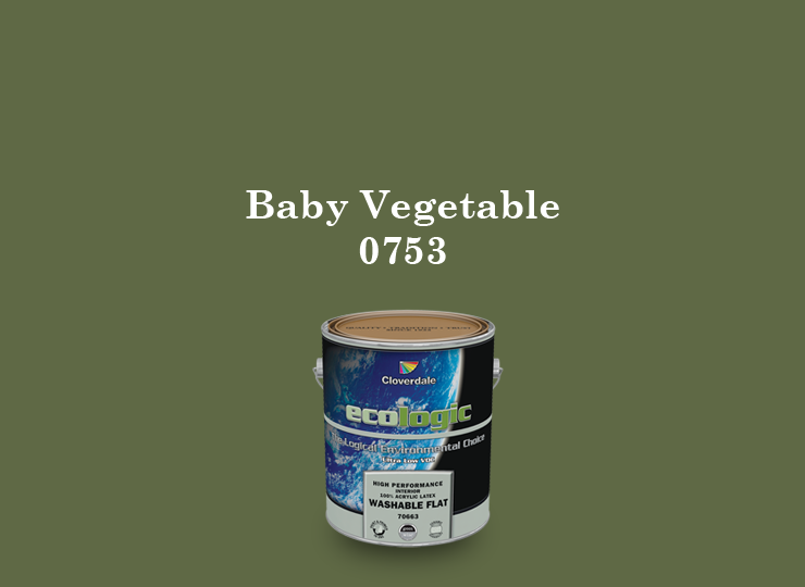
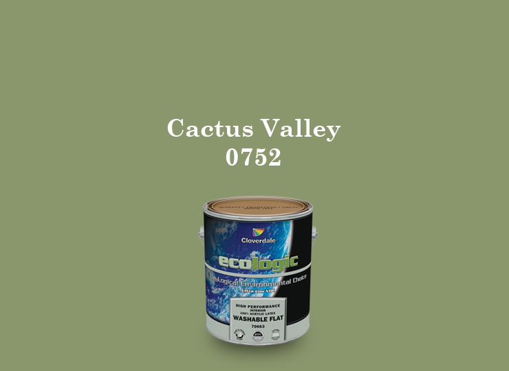
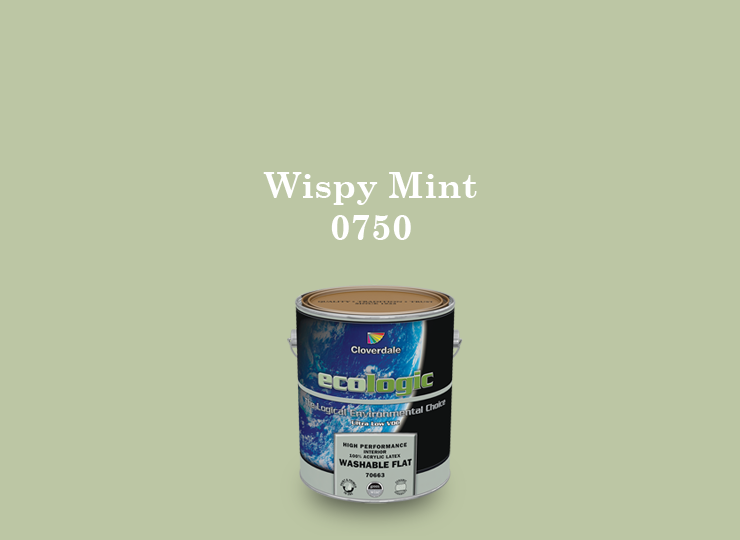
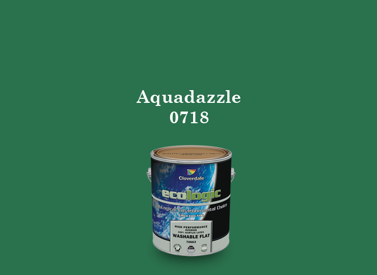
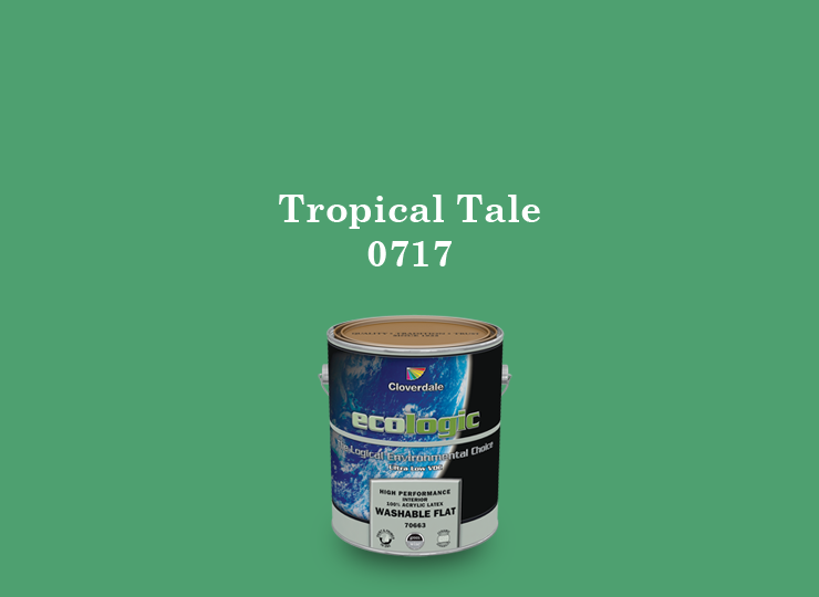
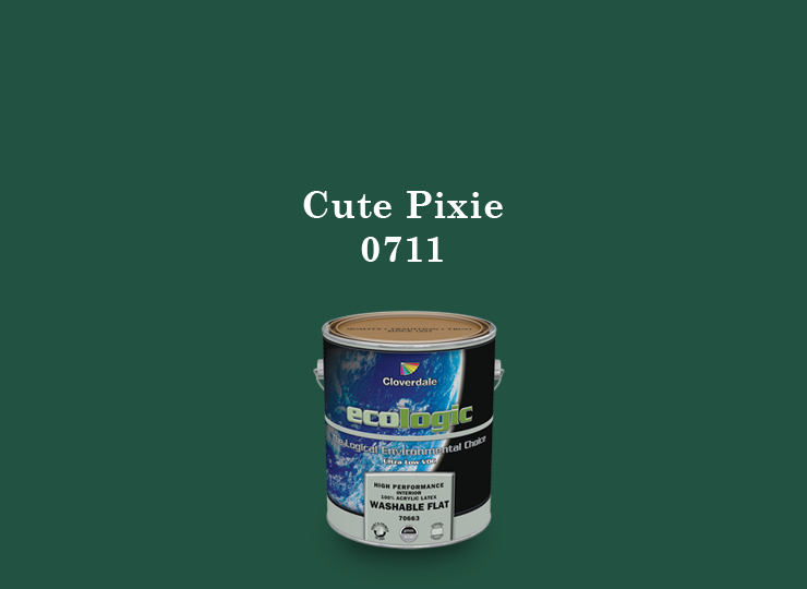
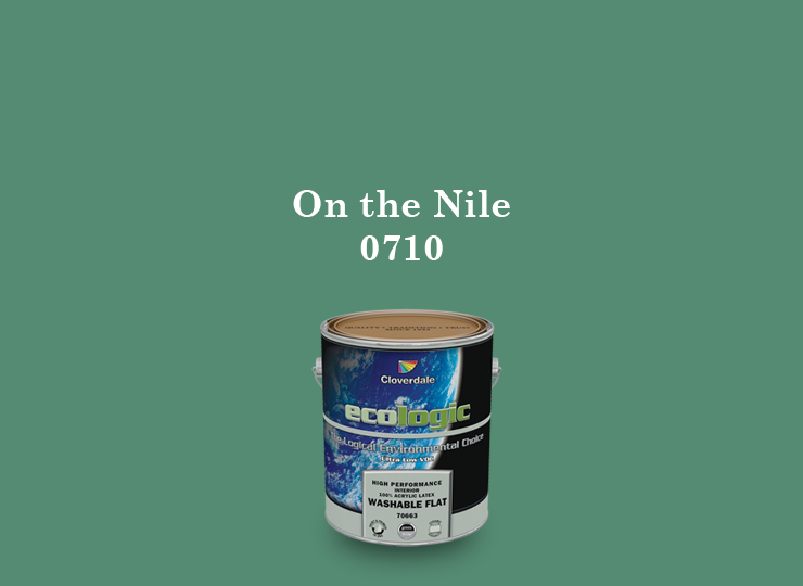
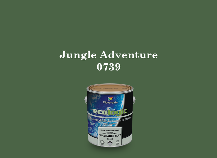
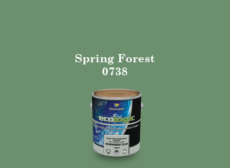
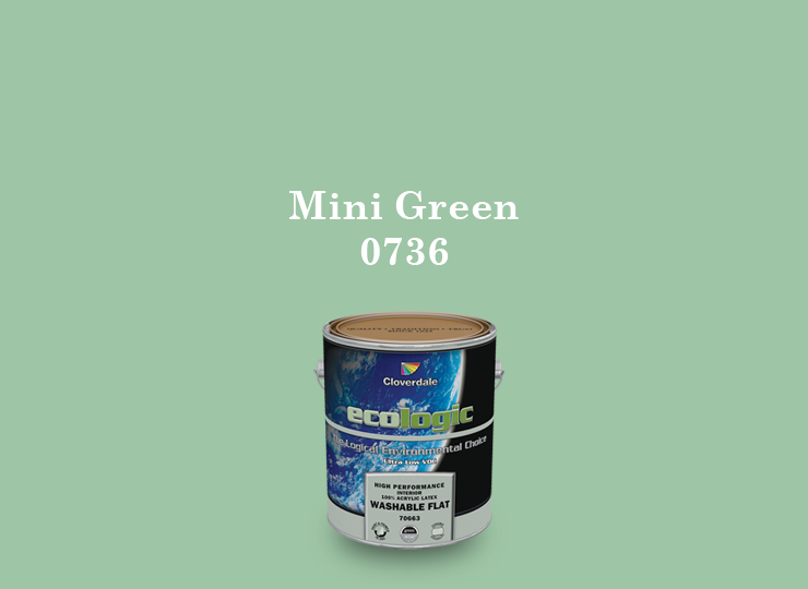
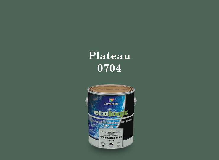
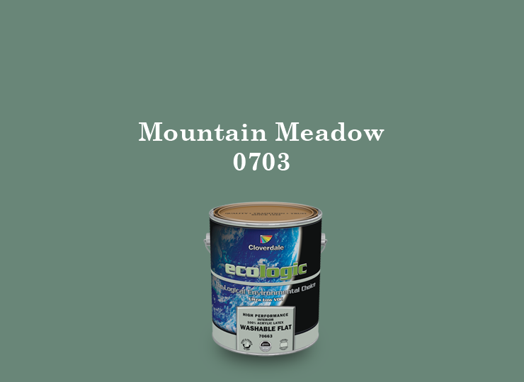
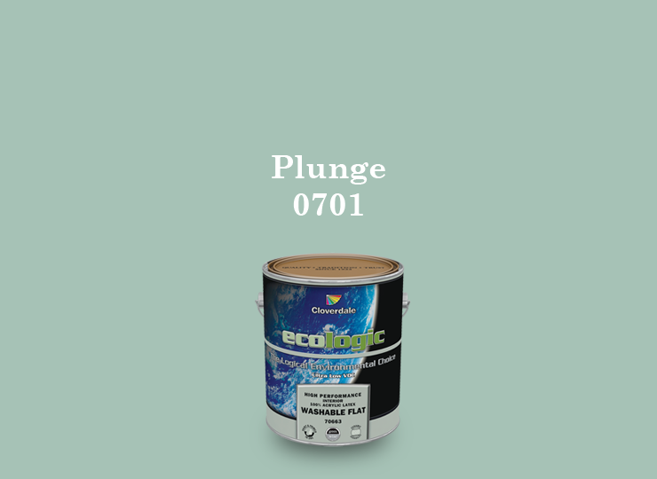
![](https://improve.ne.jp/wp-content/uploads/2023/07/ygreen01-01.png)
![](https://improve.ne.jp/wp-content/uploads/2023/07/ygreen02-01.png)
![](https://improve.ne.jp/wp-content/uploads/2023/07/ygreen03-01.png)
![](https://improve.ne.jp/wp-content/uploads/2023/07/ygreen04-01.png)
![](https://improve.ne.jp/wp-content/uploads/2023/07/ygreen05-01.png)
![](https://improve.ne.jp/wp-content/uploads/2023/07/ygreen06-01.png)
![](https://improve.ne.jp/wp-content/uploads/2023/07/ygreen07-01.png)
![](https://improve.ne.jp/wp-content/uploads/2023/07/ygreen08-01.png)
![](https://improve.ne.jp/wp-content/uploads/2023/07/ygreen09-01.png)
![](https://improve.ne.jp/wp-content/uploads/2023/07/ygreen10-01.png)
![](https://improve.ne.jp/wp-content/uploads/2023/07/ygreen11-01.png)
![](https://improve.ne.jp/wp-content/uploads/2023/07/ygreen12-01.png)
グリーン
深みのあるシーグリーンやボトルグリーンはインテリア上級者。近年ファッションでも人気のグリーンをカーテンやクッションなどのファブリックと合わせるのが◎。気分を新たにトライしてみてください。
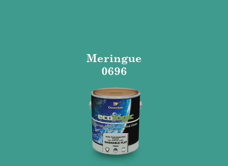
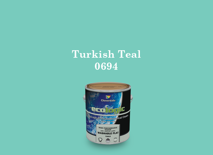
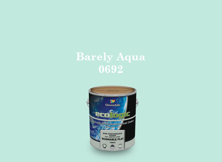
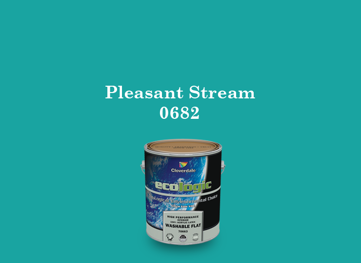
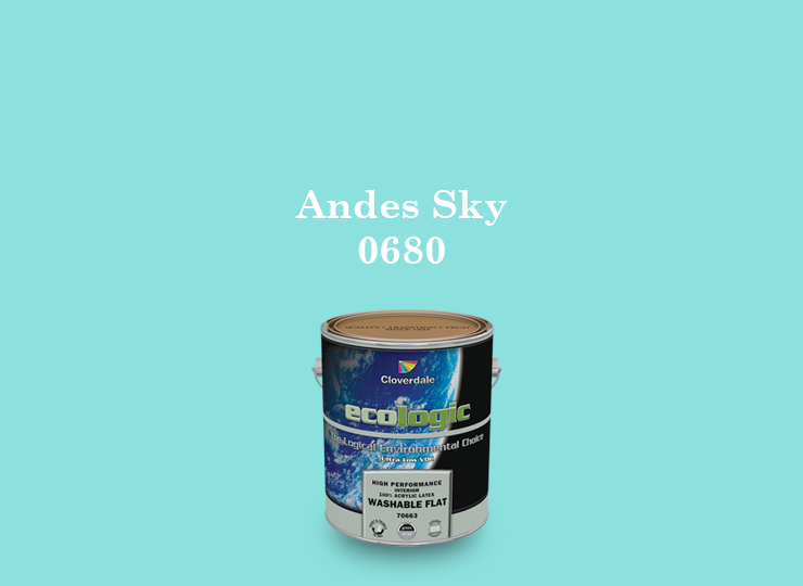
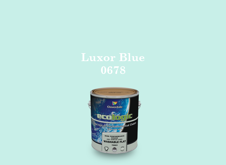
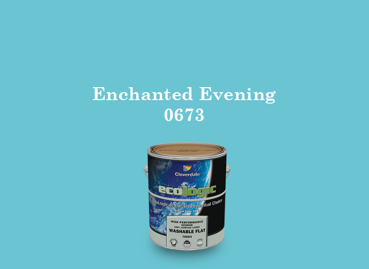
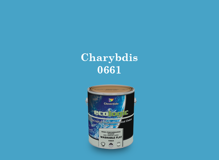
![](https://improve.ne.jp/wp-content/uploads/2023/07/green01-01.png)
![](https://improve.ne.jp/wp-content/uploads/2023/07/green02-01.png)
![](https://improve.ne.jp/wp-content/uploads/2023/07/green03-01.png)
![](https://improve.ne.jp/wp-content/uploads/2023/07/green04-01.png)
![](https://improve.ne.jp/wp-content/uploads/2023/07/green05-01.png)
![](https://improve.ne.jp/wp-content/uploads/2023/07/green06-01.png)
![](https://improve.ne.jp/wp-content/uploads/2023/07/green07-01.png)
![](https://improve.ne.jp/wp-content/uploads/2023/07/green08-01.png)
![](https://improve.ne.jp/wp-content/uploads/2023/07/green09-01.png)
![](https://improve.ne.jp/wp-content/uploads/2023/07/green10-01.png)
![](https://improve.ne.jp/wp-content/uploads/2023/07/green11-01.png)
![](https://improve.ne.jp/wp-content/uploads/2023/07/green12-01.png)
ブルー&グリーンのターコイズ
なぜか心惹かれるターコイズ。ターコイズのみのペイントコレクションは少ないですが、実はネットショッピングではいちばん人気のカラーカテゴリーです。白やパープル、くすみカラーと合わせる色で表情が変わる色です。
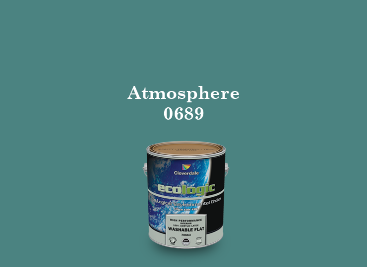
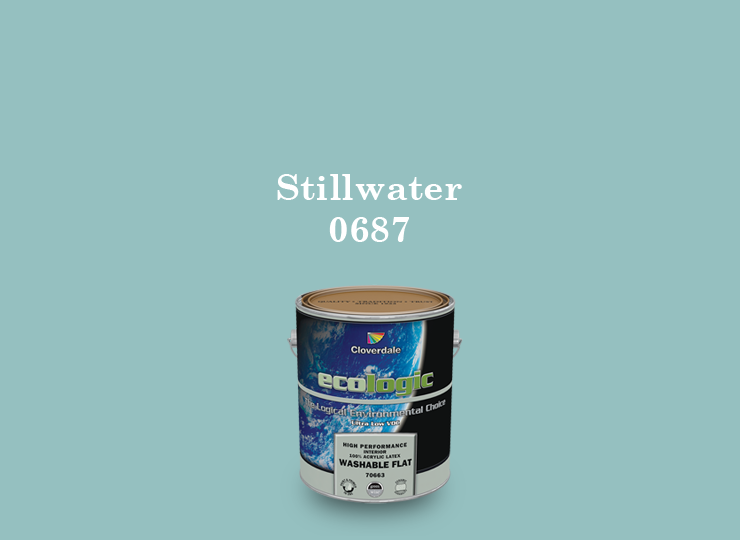
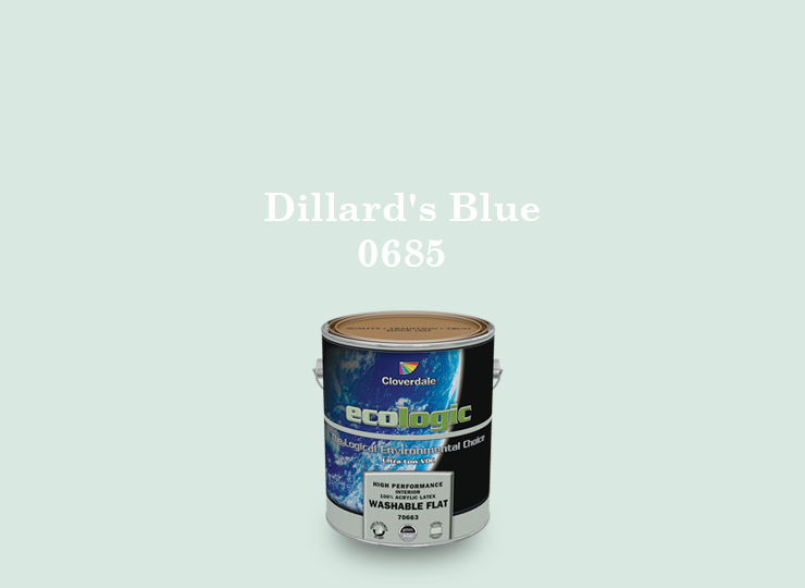
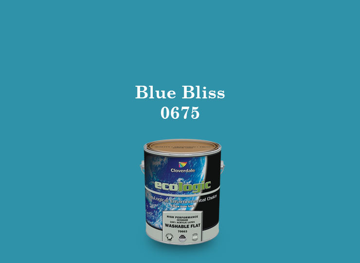
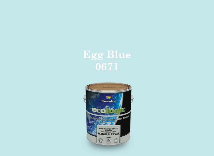
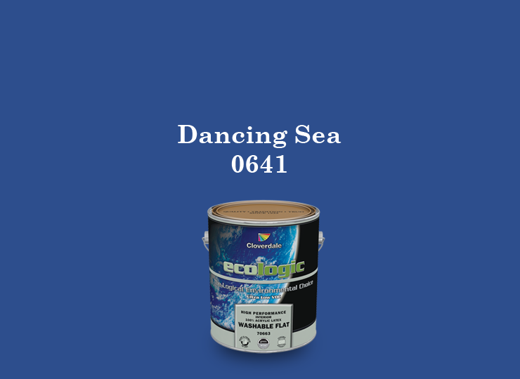
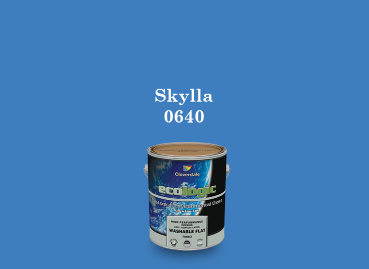
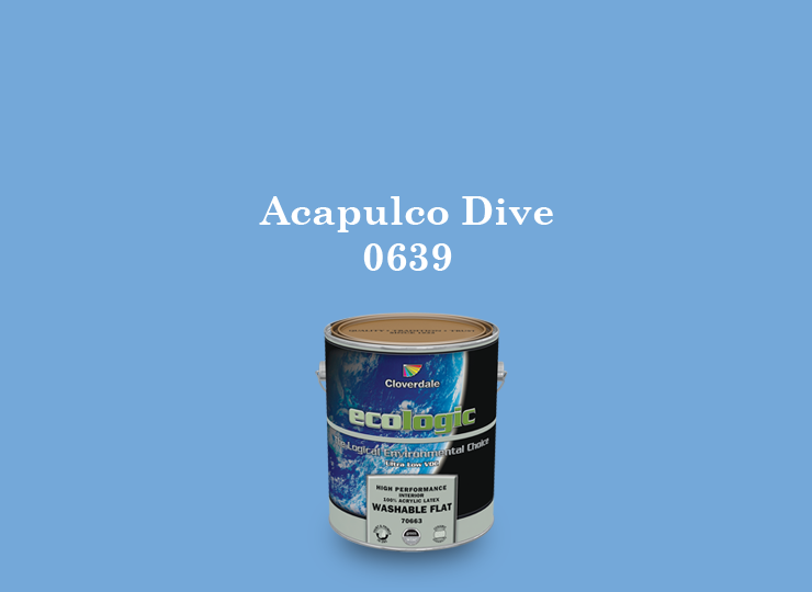
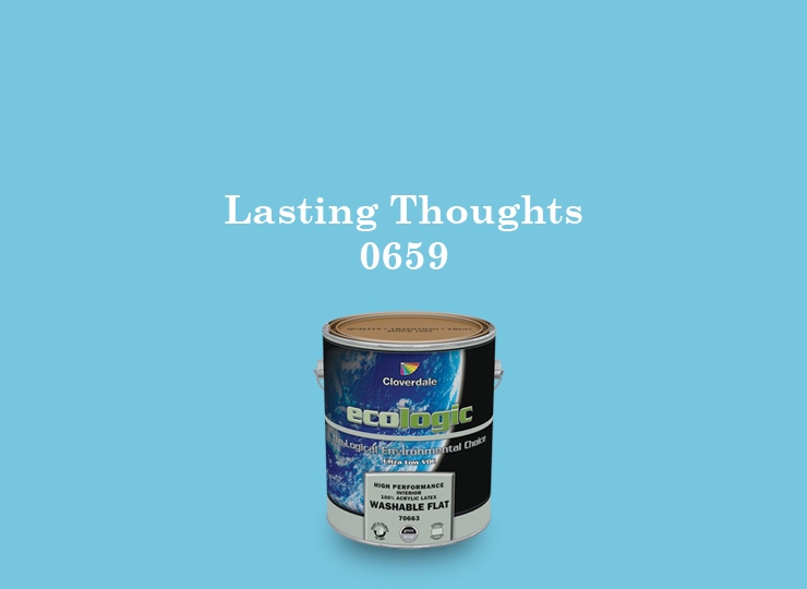
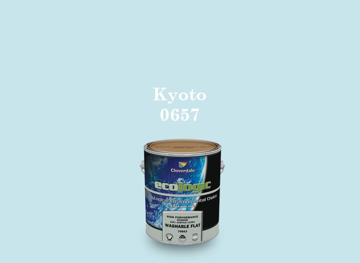
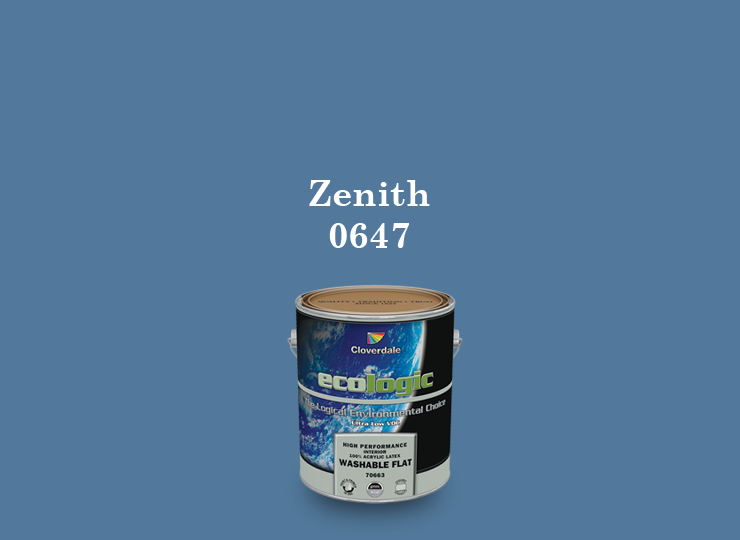
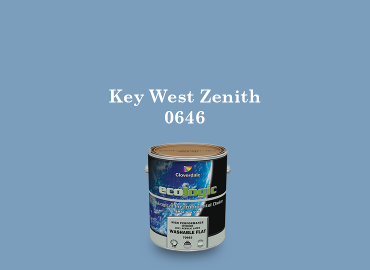
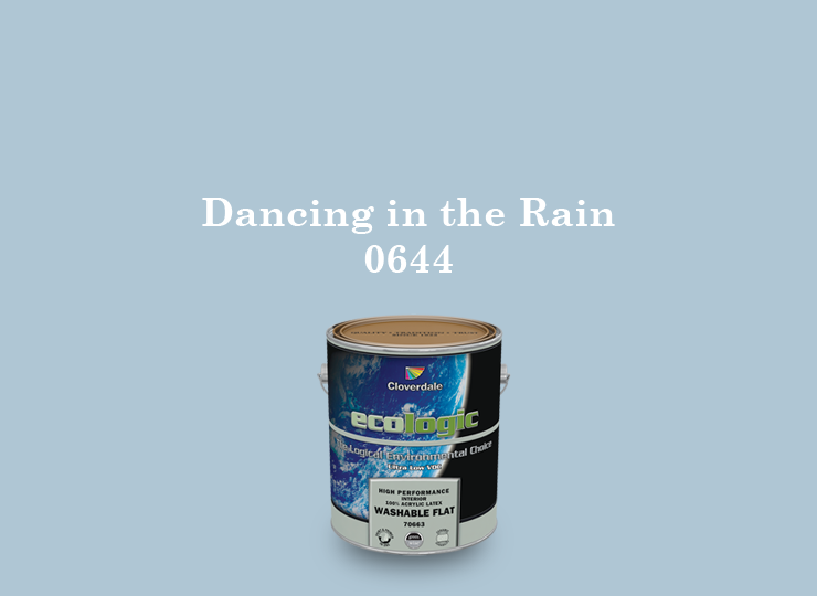
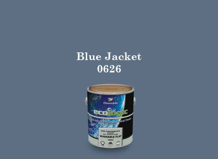
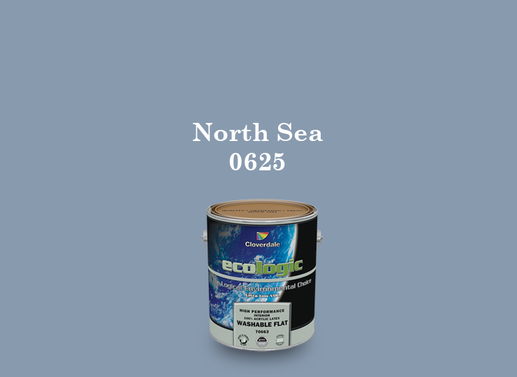
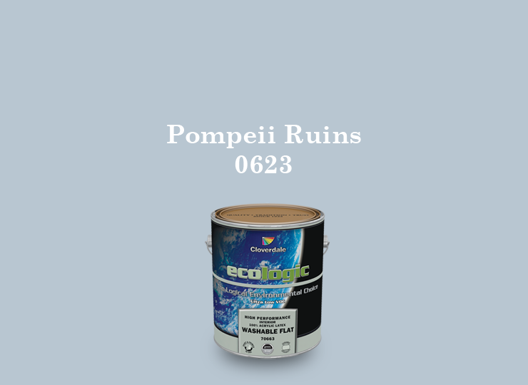
![](https://improve.ne.jp/wp-content/uploads/2023/07/bgreen01-01.png)
![](https://improve.ne.jp/wp-content/uploads/2023/07/bgreen02-01.png)
![](https://improve.ne.jp/wp-content/uploads/2023/07/bgreen03-01.png)
![](https://improve.ne.jp/wp-content/uploads/2023/07/bgreen04-01.png)
![](https://improve.ne.jp/wp-content/uploads/2023/07/bgreen05-01.png)
![](https://improve.ne.jp/wp-content/uploads/2023/07/bgreen06-01.png)
![](https://improve.ne.jp/wp-content/uploads/2023/07/bgreen07-01.png)
![](https://improve.ne.jp/wp-content/uploads/2023/07/bgreen08-01.png)
![](https://improve.ne.jp/wp-content/uploads/2023/07/bgreen09-01.png)
![](https://improve.ne.jp/wp-content/uploads/2023/07/bgreen10-01.png)
![](https://improve.ne.jp/wp-content/uploads/2023/07/bgreen11-01.png)
![](https://improve.ne.jp/wp-content/uploads/2023/07/bgreen12-01.png)
ブルー&ブルーグレー
淡い色から深いブルーまで、特にブルーグレーのラインナップにはこだわっています。アクセントウォールのカラーとして一番取り入れやすいです。
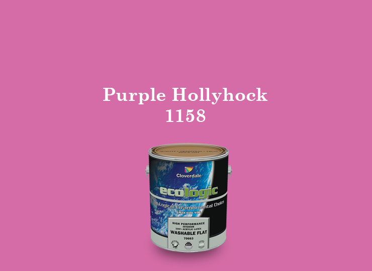
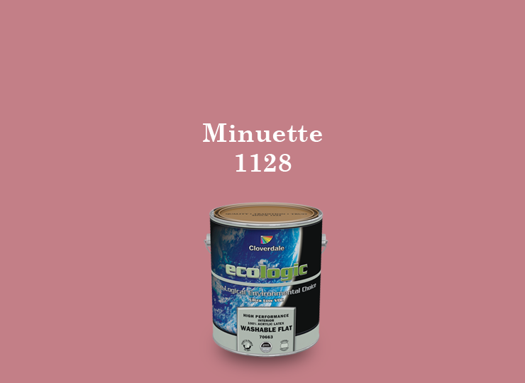
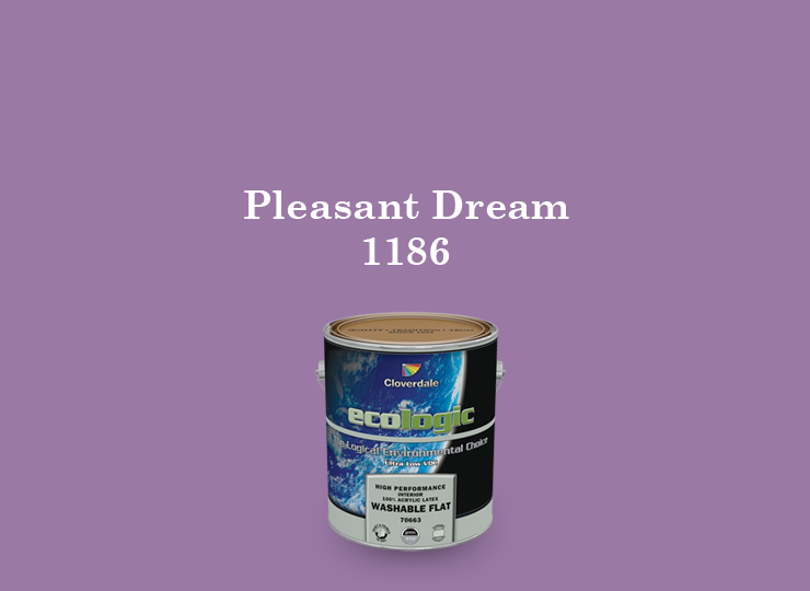
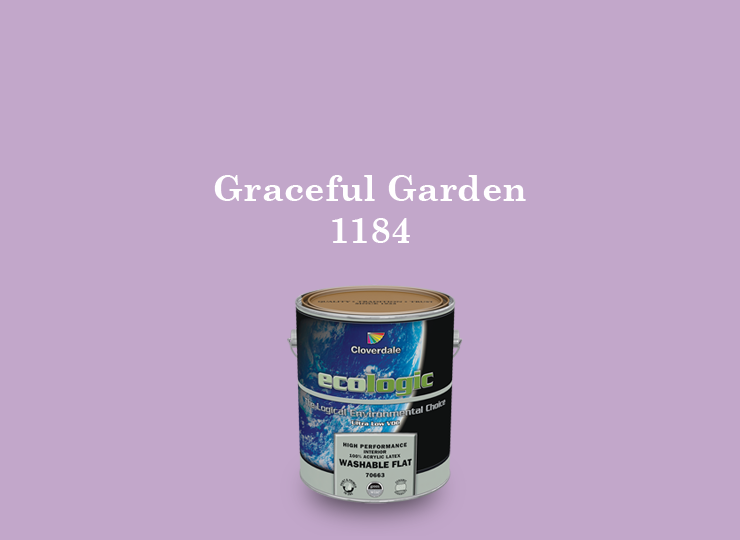
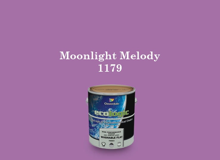
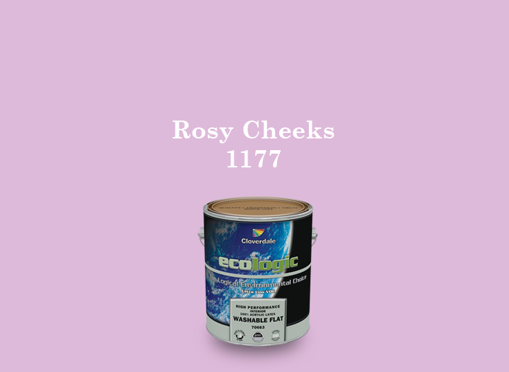
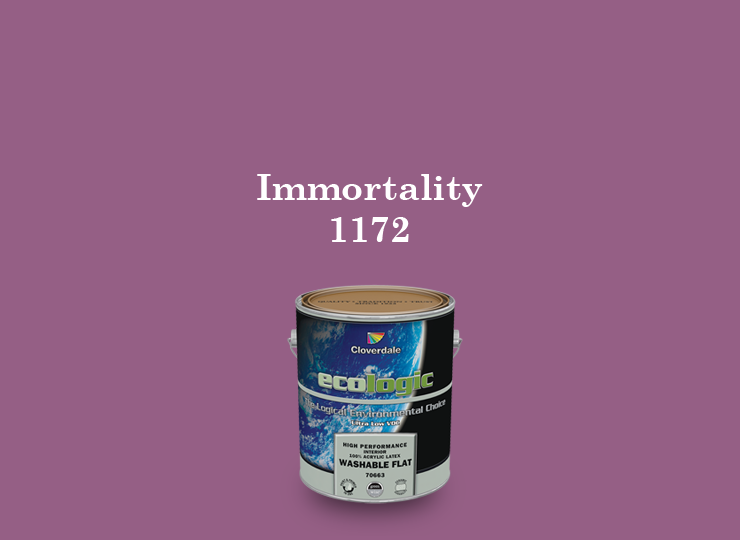
![](https://improve.ne.jp/wp-content/uploads/2023/07/blue01-01.png)
![](https://improve.ne.jp/wp-content/uploads/2023/07/blue02-01.png)
![](https://improve.ne.jp/wp-content/uploads/2023/07/blue03-01.png)
![](https://improve.ne.jp/wp-content/uploads/2023/07/blue04-01.png)
![](https://improve.ne.jp/wp-content/uploads/2023/07/blue05-01.png)
![](https://improve.ne.jp/wp-content/uploads/2023/07/blue06-01.png)
![](https://improve.ne.jp/wp-content/uploads/2023/07/blue07-01.png)
![](https://improve.ne.jp/wp-content/uploads/2023/07/blue08-01.png)
![](https://improve.ne.jp/wp-content/uploads/2023/07/blue09-01.png)
![](https://improve.ne.jp/wp-content/uploads/2023/07/blue10-01.png)
![](https://improve.ne.jp/wp-content/uploads/2023/07/blue11-01.png)
![](https://improve.ne.jp/wp-content/uploads/2023/07/blue12-01.png)
マゼンタカラーとパープル
赤みの強いマゼンタカラーはエレガントで上品な空間に。インテリアで紫は少し難しい色ですが、同系色やグレー系と組み合わせるとまとまりのある空間になります。
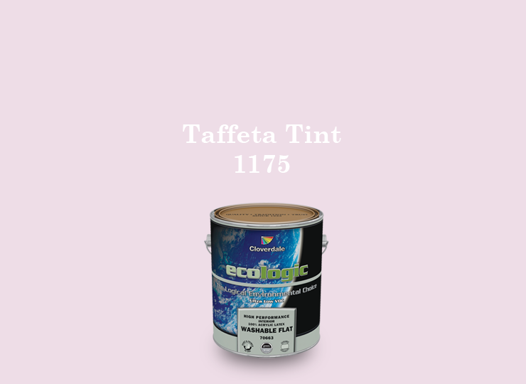
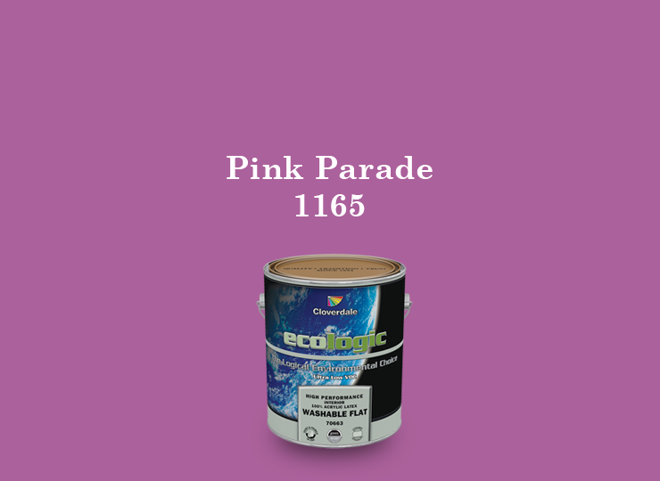
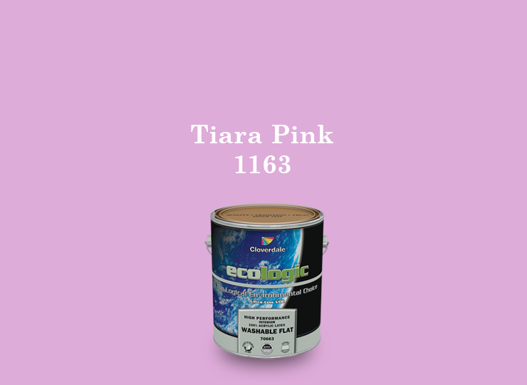
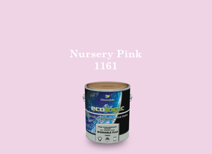
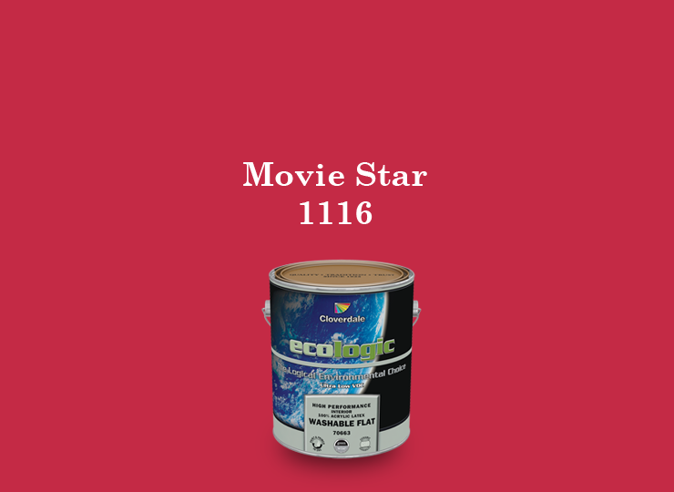
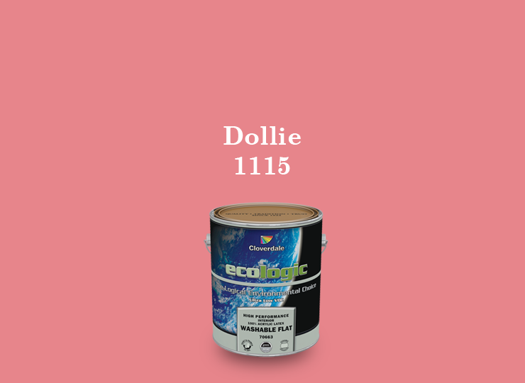
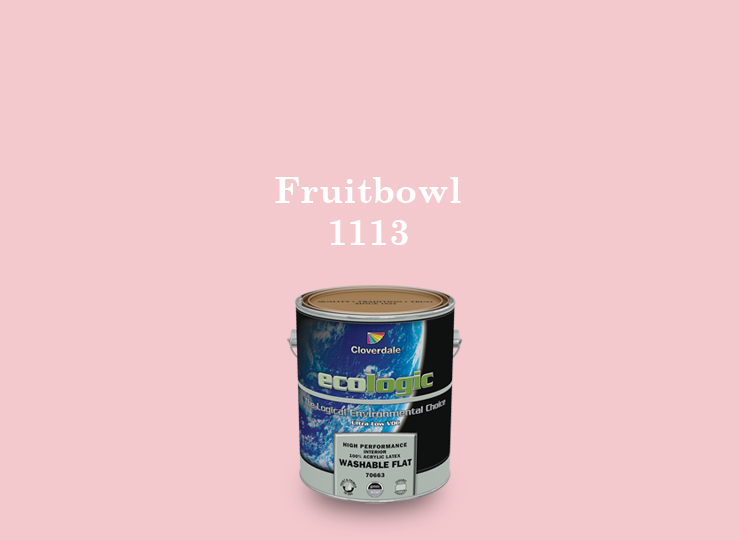
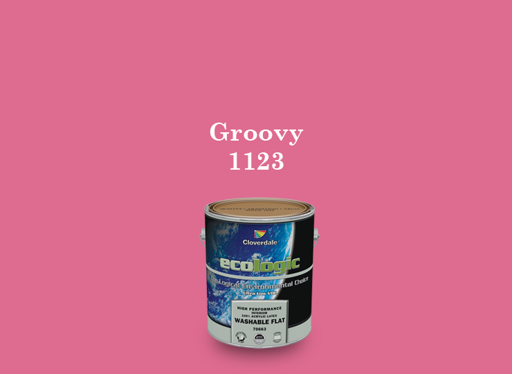
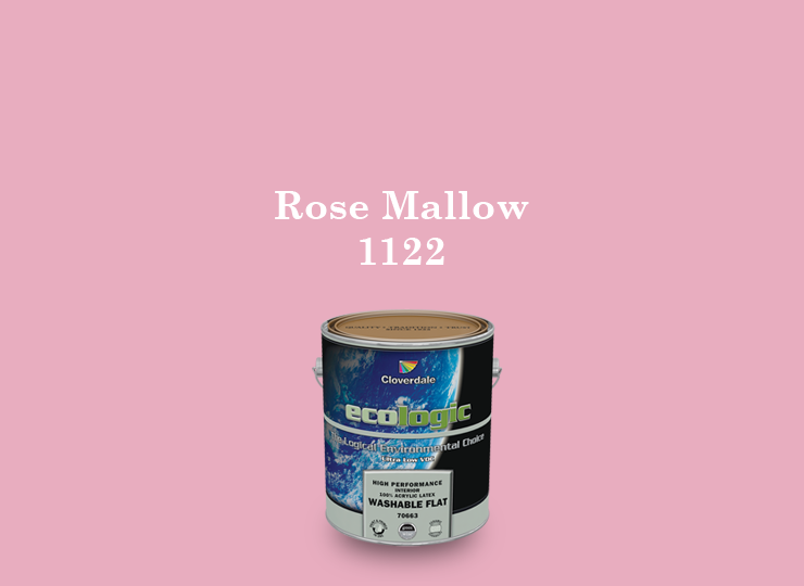
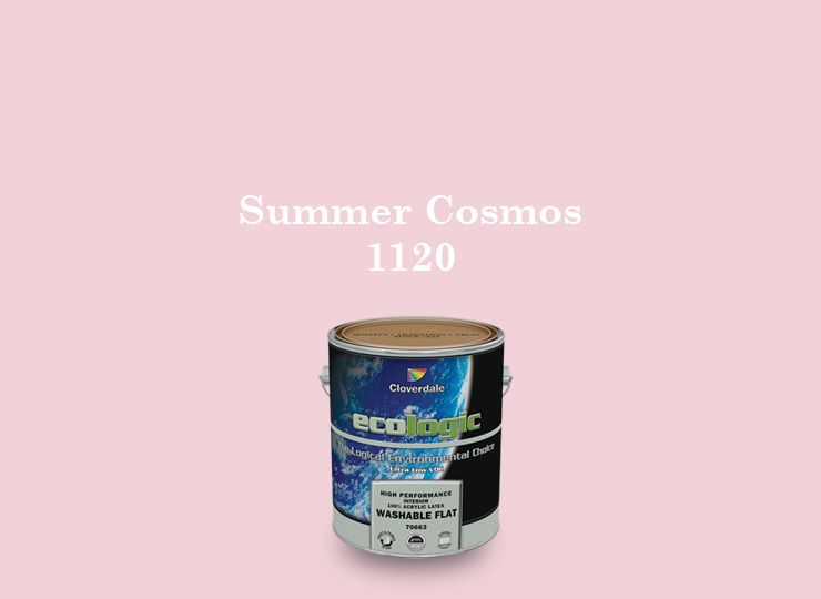
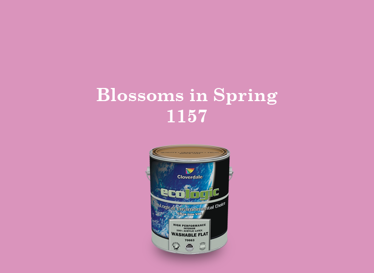
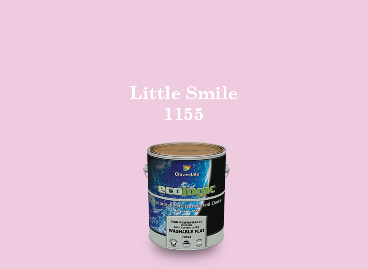
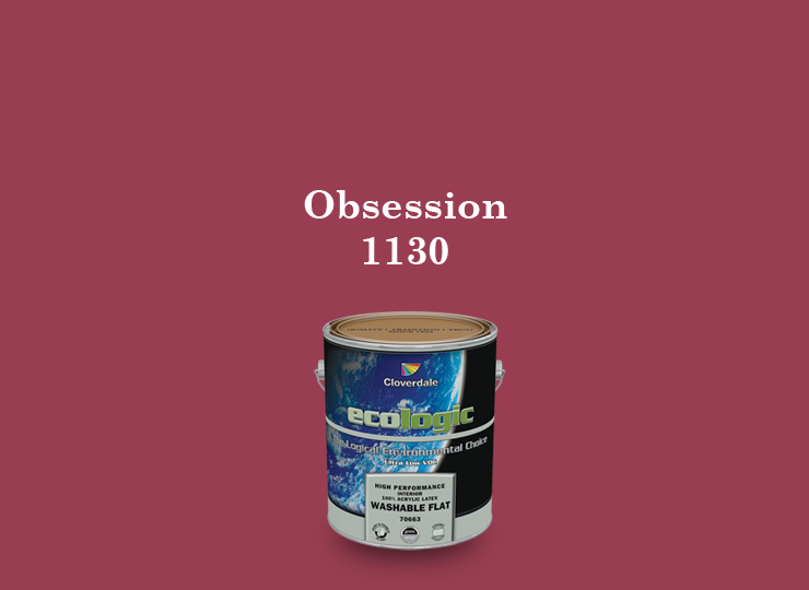
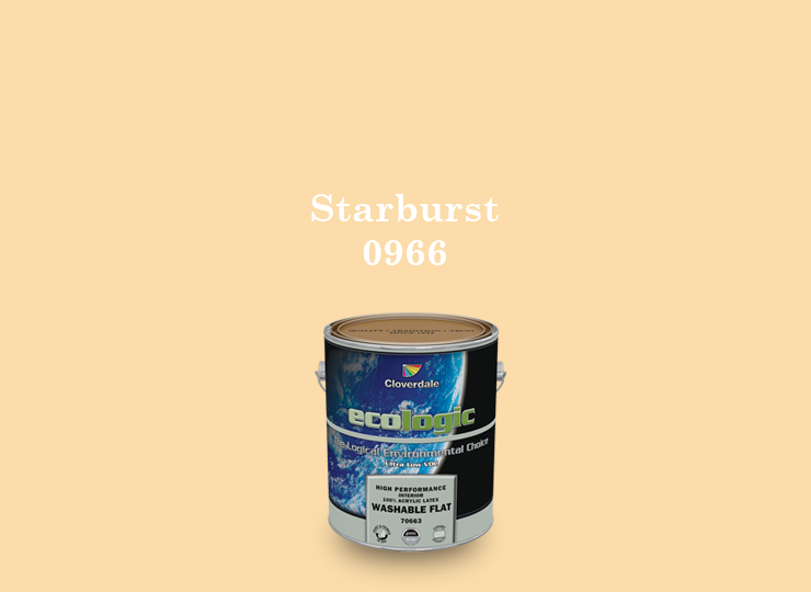
![](https://improve.ne.jp/wp-content/uploads/2023/07/purple01-01.png)
![](https://improve.ne.jp/wp-content/uploads/2023/07/purple02-01.png)
![](https://improve.ne.jp/wp-content/uploads/2023/07/purple03-01.png)
![](https://improve.ne.jp/wp-content/uploads/2023/07/purple04-01.png)
![](https://improve.ne.jp/wp-content/uploads/2023/07/purple05-01.png)
![](https://improve.ne.jp/wp-content/uploads/2023/07/purple06-01.png)
![](https://improve.ne.jp/wp-content/uploads/2023/07/purple07-01.png)
![](https://improve.ne.jp/wp-content/uploads/2023/07/purple08-01.png)
![](https://improve.ne.jp/wp-content/uploads/2023/07/purple09-01.png)
![](https://improve.ne.jp/wp-content/uploads/2023/07/purple10-01.png)
![](https://improve.ne.jp/wp-content/uploads/2023/07/purple11-01.png)
![](https://improve.ne.jp/wp-content/uploads/2023/07/purple12-01.png)
赤からピンク、くすみピンクまで
パッと目を引く赤はインパクト大。情熱の赤の空間は特別。淡いピンクはニュアンスの違いで甘めも辛口も、バリエーションの豊富さがピンクの魅力です。
![](https://improve.ne.jp/wp-content/uploads/2023/07/red01-01.png)
![](https://improve.ne.jp/wp-content/uploads/2023/07/red02-01.png)
![](https://improve.ne.jp/wp-content/uploads/2023/07/red03-01.png)
![](https://improve.ne.jp/wp-content/uploads/2023/07/red04-01.png)
![](https://improve.ne.jp/wp-content/uploads/2023/07/red05-01.png)
![](https://improve.ne.jp/wp-content/uploads/2023/07/red06-01.png)
![](https://improve.ne.jp/wp-content/uploads/2023/07/red07-01.png)
![](https://improve.ne.jp/wp-content/uploads/2023/07/red08-01.png)
![](https://improve.ne.jp/wp-content/uploads/2023/07/red09-01.png)
![](https://improve.ne.jp/wp-content/uploads/2023/07/red10-01.png)
![](https://improve.ne.jp/wp-content/uploads/2023/07/red11-01.png)
![](https://improve.ne.jp/wp-content/uploads/2023/07/red12-01.png)